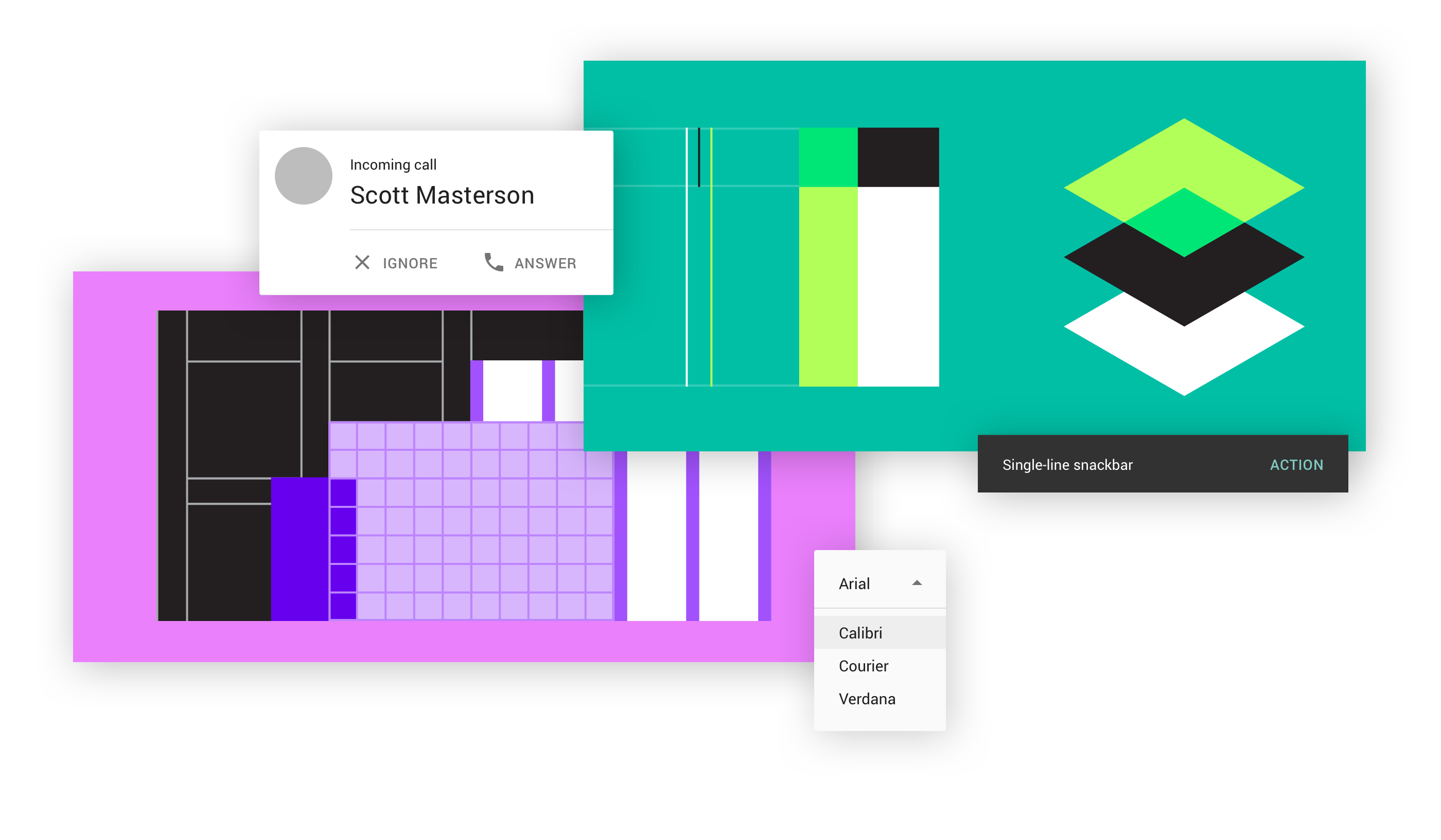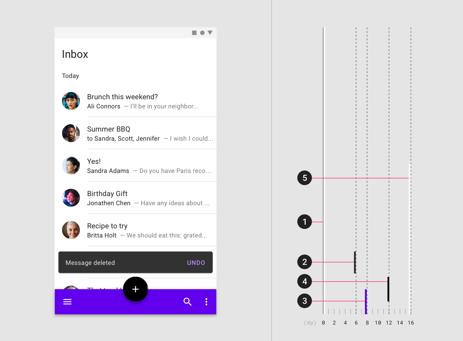
I've always admired the work done around design systems, such as the one designed by Google: Google Material Design. All this thinking about molecular design can only be remarkable. However, I still considered these systems as "self-service kits" for developers who want to try their hand at interface design.
In reality, this is frequently the case. The facilities provided by environments such as Bootstrap or Foundation and their "à la carte" components tend to make design systems look like libraries. You pick and choose, assemble and you're done. While it is true that the similarities are strong at first glance, it is to considerably reduce the scope of the design system to approach it in this way, and that is my first lesson.
The strength of a design system is not just its multitude of components, it is the set of rules and guidelines that govern them and make them work together.

It was when I applied it to a B2B web application project, methodically and in accordance with its guiding principles, that the magic happened.
The more the screens were declined, about sixty in total, the more I realized how much this system was able to cover an infinite number of problems and to bring a very strong coherence to the whole experience. The Google Material Design was confronted with the difficulties regularly encountered in a B2B environment: complex forms at several levels, management of data organized in tables, cohabitation of several option menus, etc.
What clearly distinguishes the design system from the aforementioned frameworks is its consideration of the properties of information: its depth, its volume, its priority.
The other dimension that shines through in the solutions proposed by Google Material Design is user comfort: displaying only useful content, at the right time, with clarity and consistency. This is absolutely obvious, but the trade-offs are not always simple in the case of applications that manage large quantities of information.
In the end, although the design system does not solve everything, it does provide a robust and well-oiled foundation on which the designer can rely. Its exhaustiveness is an undeniable asset. Its comprehensiveness makes it possible to envisage large-scale products, to dimension them, to decline them while maintaining a strong consistency between them. This is why the big producers of applications or services have in turn created their own design systems: Airbnb, Axa, Salesforce or even Lonely Planet.
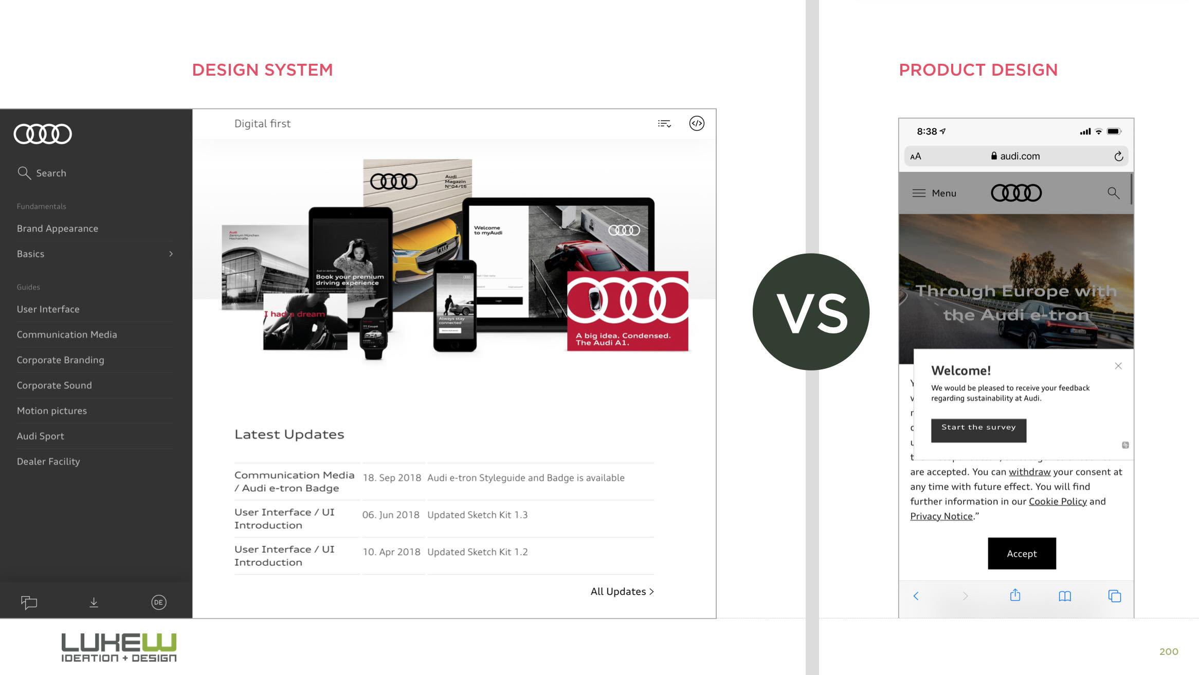
To the point of making it a "must have" for certain brands, which forget in passing that it is not the tool that makes the man. A design system does not prevent a bad user experience, success lies in the art and manner of making the most of it.

Extrait du tweet de Luke Wroblewski : your design system is a distraction.
We have also written :
Article created on by Thomas Le Mouellic. Edited on .

