We supported Easy Snowboards in the consolidation of its identity: brand universe, logotypes and visual language.
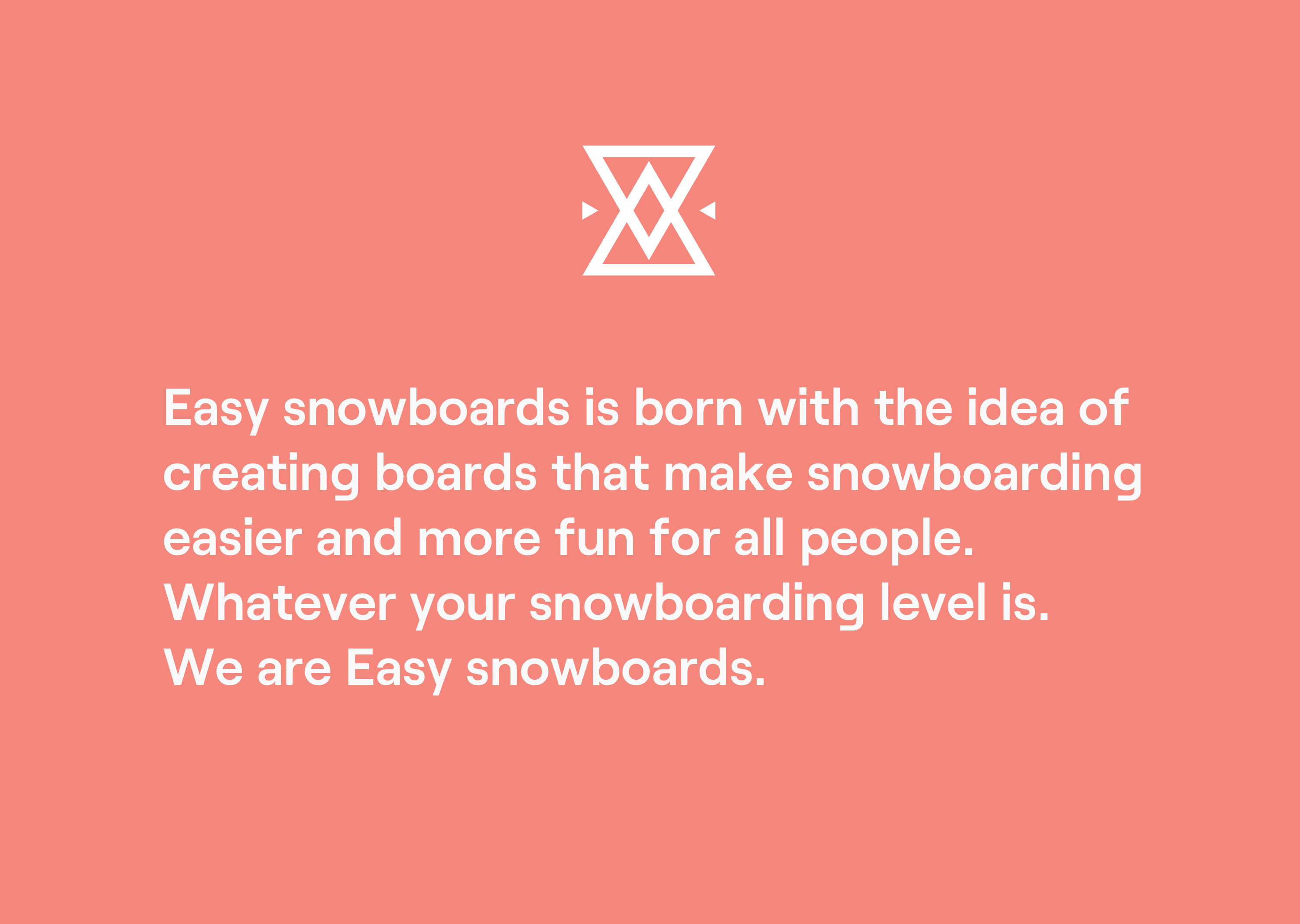
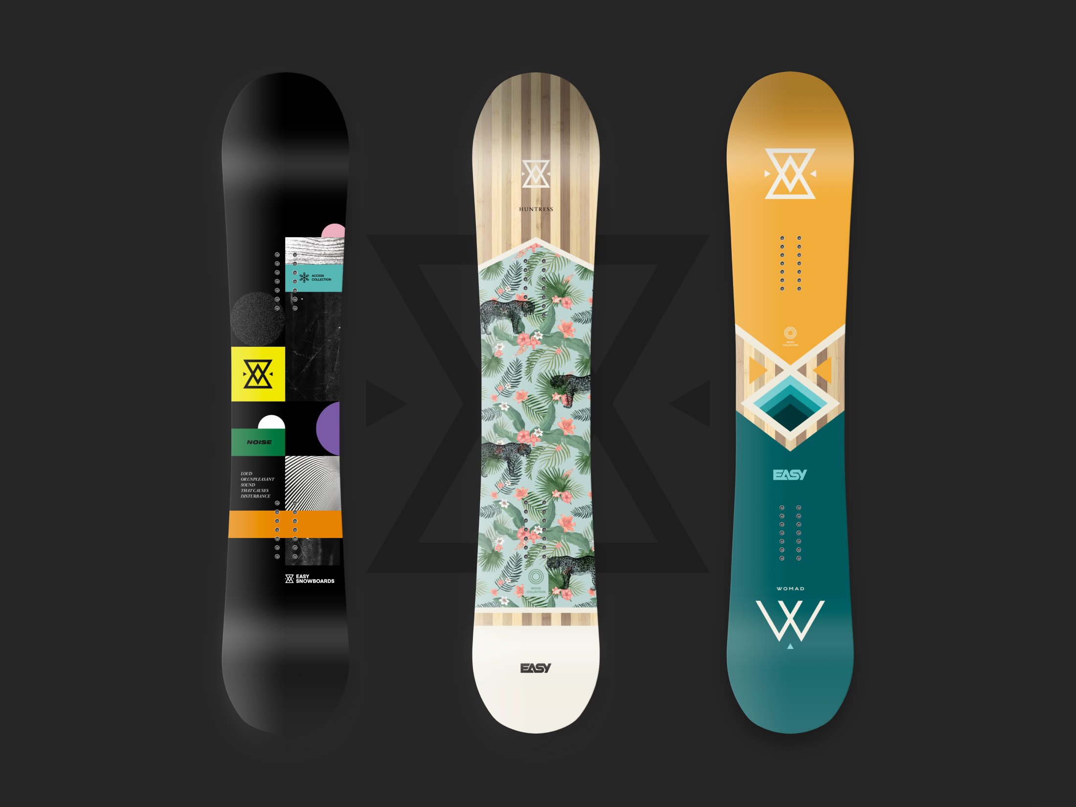
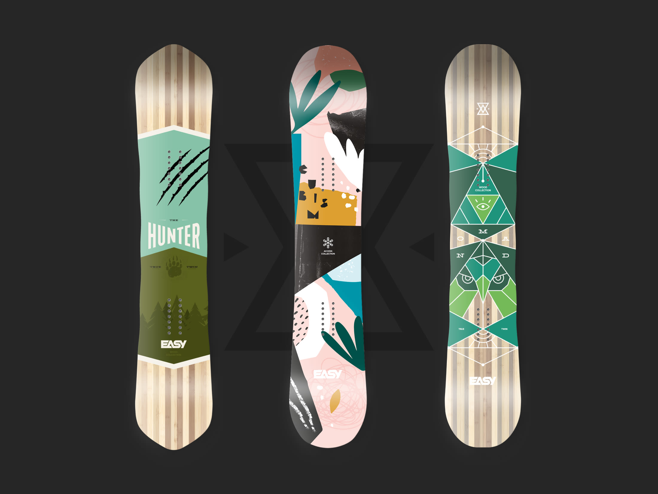
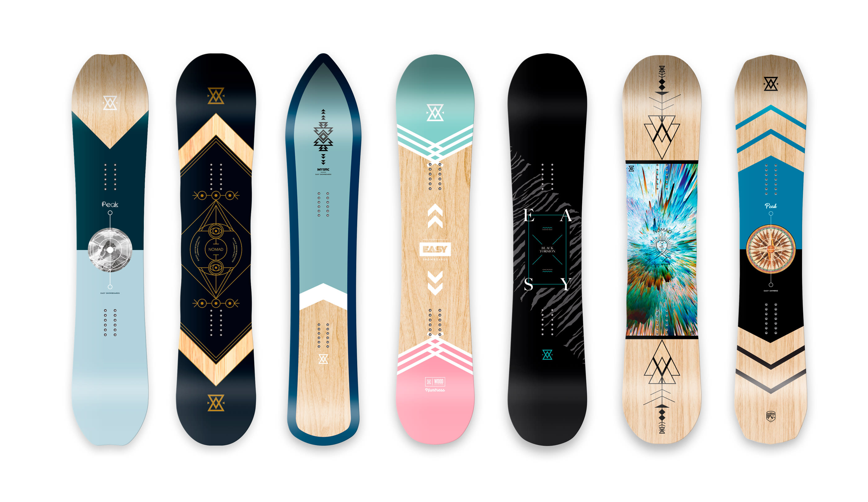
After a few years of existence, Easy has remained faithful to its founding principles: to offer high quality boards accessible to all. Easy is a field brand, driven by the pleasure of the practice and the satisfaction of the snowboarders who put their trust in it. Its assertive designs are distinguished by a graphic universe imbued with esotericism, sacred geometry and references to primitive arts.
Easy's lettering is an essential and installed visual signature. We have simply reworked it for more homogeneity and consistency.
On the left is the original version.

The different application cases confirmed the need for a more legible logo.
The insignia has been separated from the original signage to match the rewritten brand name in proportion. The redesigned graphic system allows for extreme cases of signage to be covered, and even more dispersed expressions when it comes to product design.


The typography, round and geometric, reflects the notions of accessibility and proximity encouraged by the brand.

