As a passionate entrepreneur, we accompanied Michael in the maturation of an export project that linked several of his interests: Australia for having lived there, craftsmanship, terroir and photography. After a study, we validated together the interest of the Australian market for tableware and its emblematic houses. Then we drew the outlines of the brand associated with his website: French Connoisseur.
Initial analysis
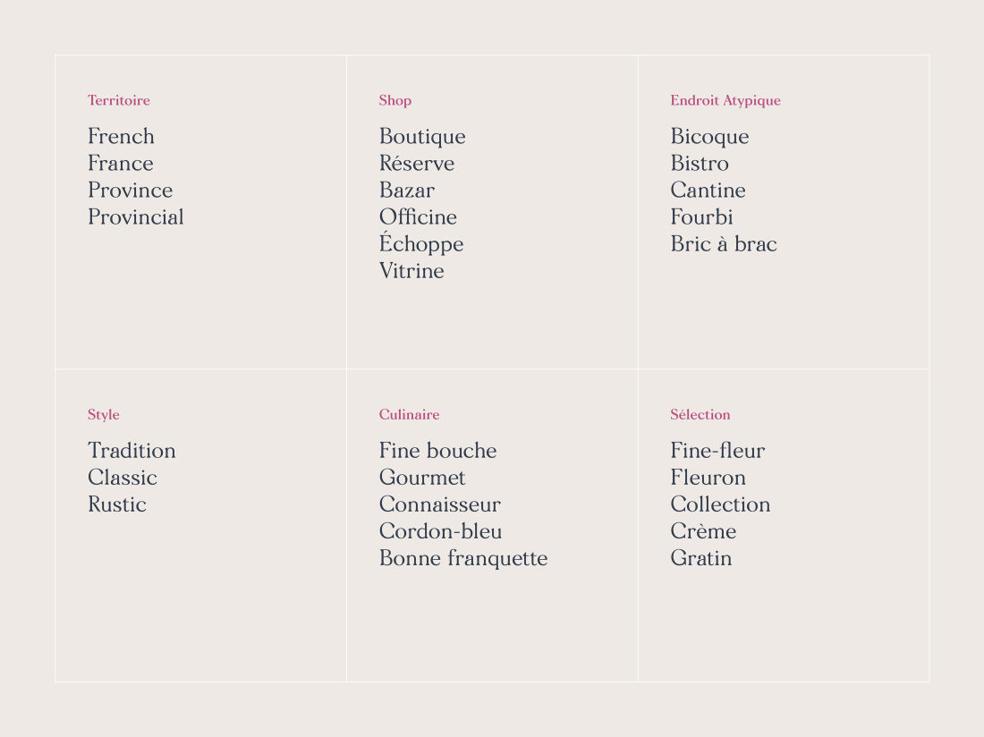
We extracted the data collected by the search engines for each of the product categories considered. This allowed us to precisely identify the most requested expressions, the brands and the combinations by our Australian target when browsing for such products. From there, the future offer of the site and the choice of suppliers were defined.

The brand
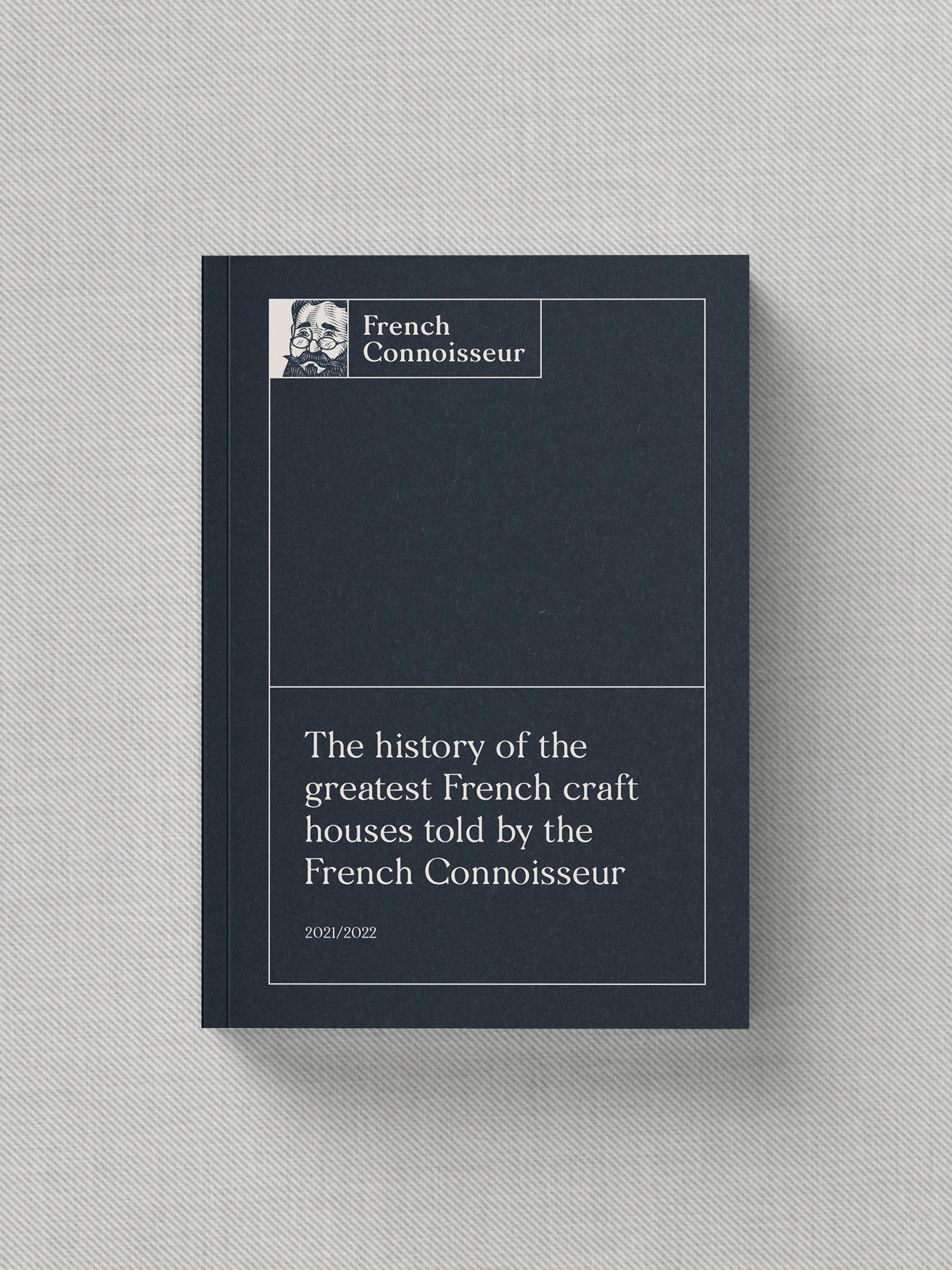
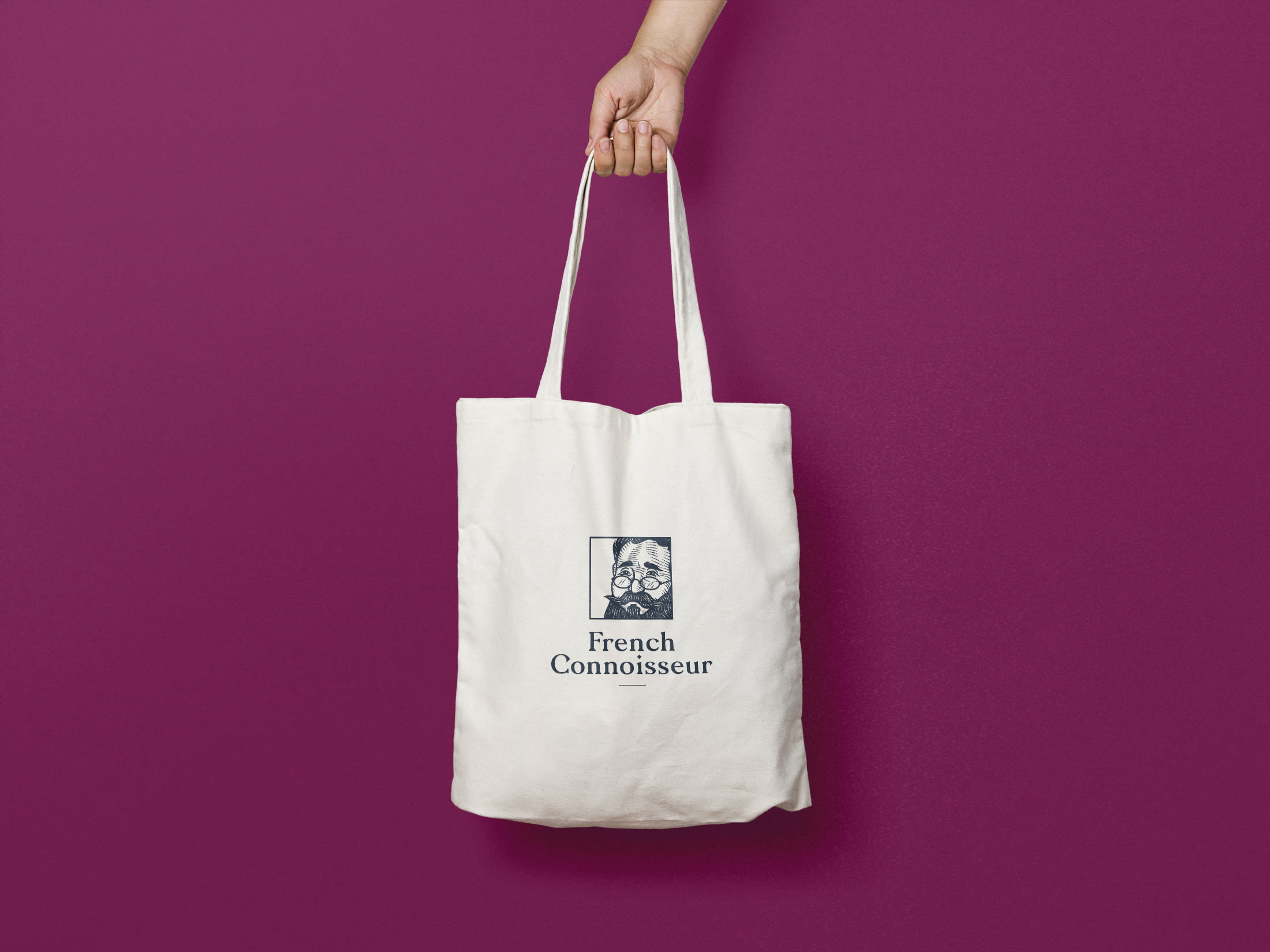
The objective: a name that is sufficiently evocative and that presages a quality selection. The English term "connoisseur" led us progressively to the idea of creating a character taken up in the badge of the logotype. The typography, chiseled and fleshy (Morion), adds an authentic facet to the whole.
The shades chosen are inspired by organic and mineral materials: woody, metallic or vegetal.

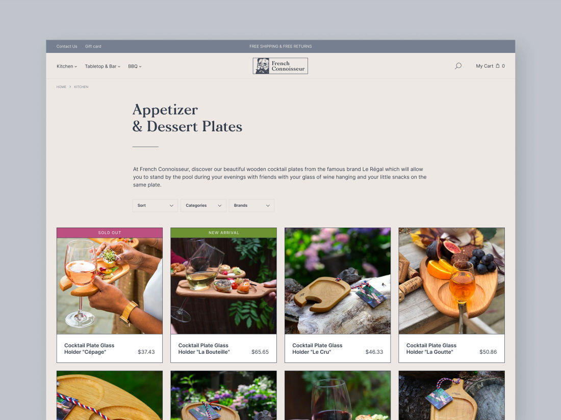
We chose Shopify to create the frenchconnoisseur.com.au website, which allowed us to develop and deploy in a record time. Ultrō also wrote various content to optimize and enhance SEO performances.

Typeface: Morion - The Designers Foundry
Illustration: Julien Fauveau
